|
In this project we had to make a clay tile... We had to pick a animal or a landscape to carve or build out of the clay. I used my own ideas because I wanted to do a snake so when I think of a snake I think of a desert. So I came up with the idea to make the ground below the snake cracked. Which I thought was really cool. 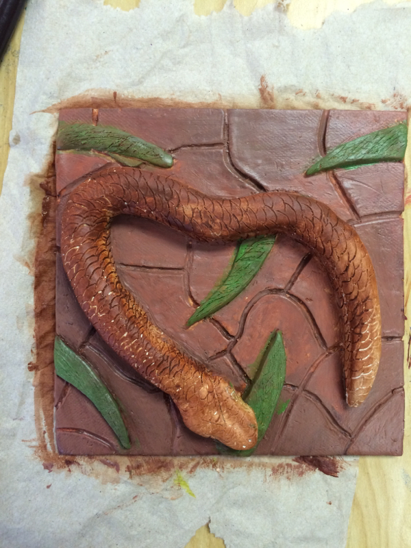 For this project I felt like I increased my skill at clay making. I have used clay before back in middle school and it was one of my favorite units. But we would only learn basic stuff. But I feel like for this project I increased my skill because I learned more techniques and had to add a lot more texture to it to make it look real which I have not done in the past. 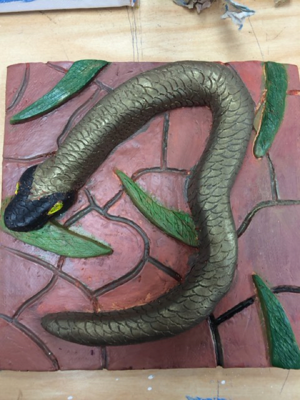 For this project I did experience some challenges when trying to make the tile and snake look real. First off I had trouble getting the clay to form into the shape I wanted for the snake. And also the head of the snake was actually pretty hard to make look real but in the end after time I got it to work. Also the cracks in the tile to make it look dry, I had to make sure those look real and make them all look like they fit together.
0 Comments
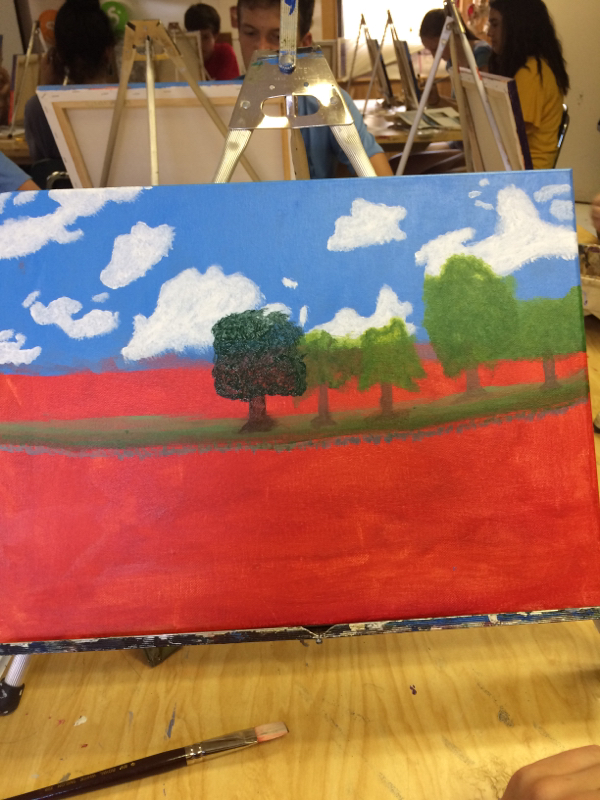 In this project we had to find a picture of a landscape and paint it. So the first thing that came to mind was to paint a picture of the pond I fish at. So I went and snapped some pictures so I could use them for reference. I'm glad I chose this idea because the clouds and the reflection off of the water was really good. 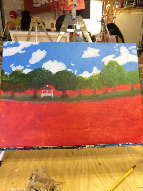 During this project I did have to learn new techniques because I never really painted a lot before. One thing I did have to learn was how to make the trees look like trees so my teacher went over with us how to do so. Then the other main thing I had to learn was how to make the reflection off of the water actually look like it is being reflected so my teacher told me to get blue paint and add water and do a light coat over the water area. Although the painting isn't the best I did learn new techniques and I'm sure I still have room for improvement. 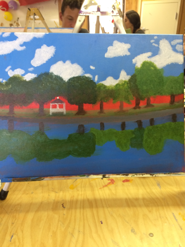 During this project my table would talk to eachother about what we think about each other's work and what we think would look cool or what they could change. While painting the trees, I would ask my neighbor if he thinks they looked good and what I could do to make them look better, and I also did the same for his project. All of ours came out pretty good, overall I did like this project, The final painting is below. 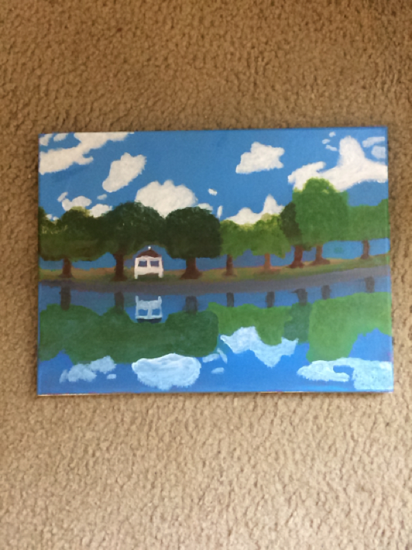 During the brainstorming part of this project I was trying to decide whether to do a city made out of game pieces or fast food boxes and cups/ food. So I started using for example KFC boxes and cups and stuff like coke cans/ and anything to do with McDonald's but after I drew some sketches I didn't like how it came out so I started thinking of game pieces I could use to make a city out of so a dice came to mind first then the pieces to the game sorry which I like to play and then chess pieces also came to mind and after I drew those sketches I liked it a lot better then the fast food idea. Some sketches are below. 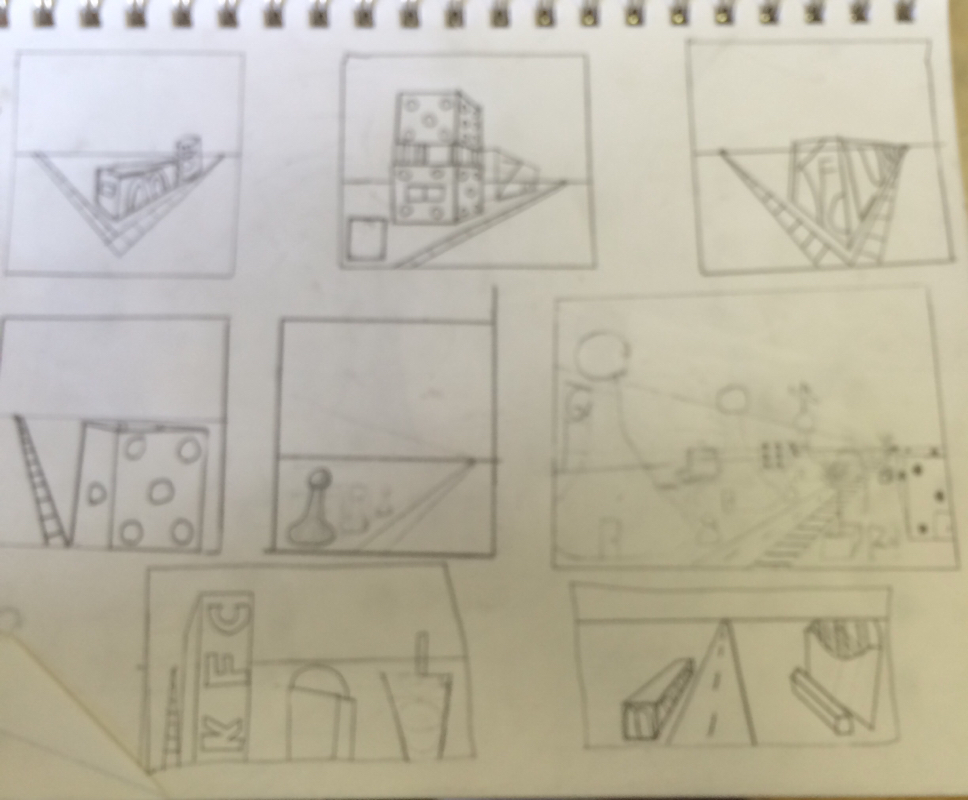 During this project we had to practice drawing things in perspective like boxes and cubes to teach us the basics and the steps we have to take to make it look right and we learn there are 1 , 2 , 3 pt perspectives which I ended up drawing a 1 point drawing. But while drawing the rough sketches and my final drawing I had some trouble making things look right for example chess pieces were a challange. But once I took it step by step it started to work. But I did definitely learn stuff about perspective that I didn't know. 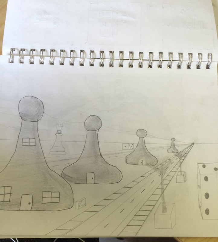 During this project I faced challanges such as trying to make things look right and look like they are actually getting smaller as the picture goes off in the distance. For example my main challange was trying to draw chess pieces for some reason I couldn't find a way to make it look right so me and my teacher looked online and found some pictures to show how to do it which after seeing those it was easy. 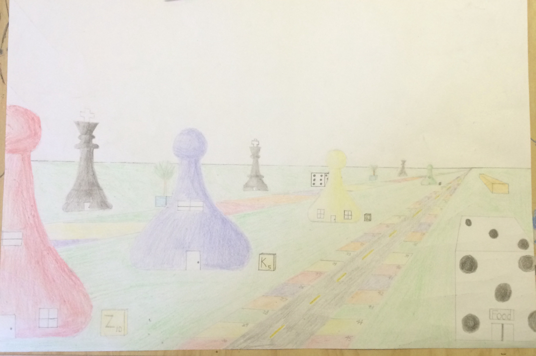 Above is the final project in progress. Below is the final product after drawing and coloring. 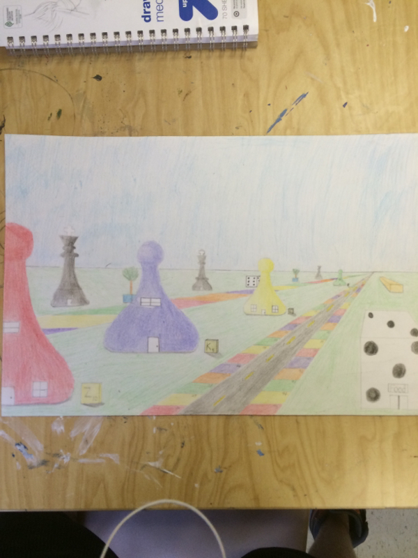 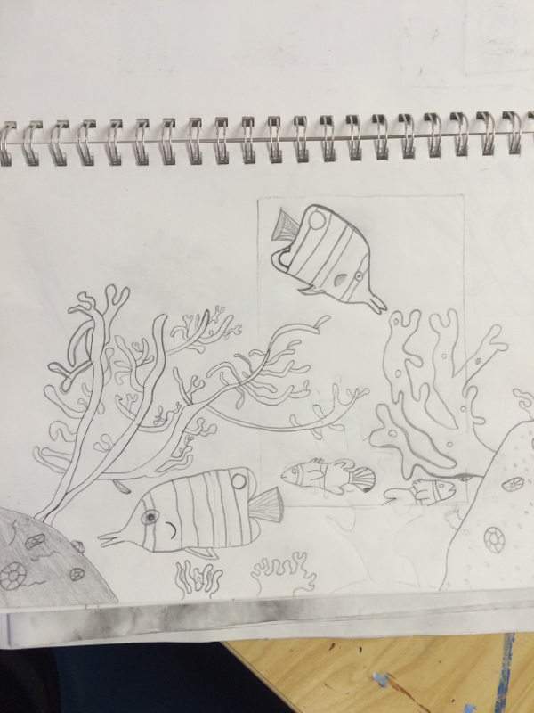 During this project I asked multiple people if they thought it looked good and what color paint I should use to make it look good and I also provide feedback to them as well.  During this process I learned how to proberly make prints which I did not know how to before... I learned that u need to show different shapes and stuff to make it all look good and how to use space wisely. 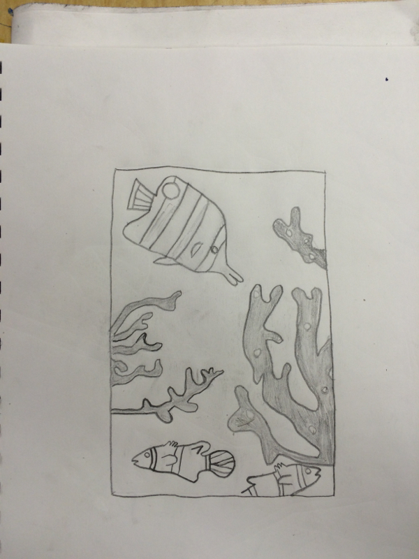 This project shows how I like anything to do with underwater / stuff in the ocean. And because I love fishing I put in the fish to show how I like fish to. It took awhile to decide what type of plants and thing to put in the final product but I chose thinks that were different sizes shapes and had lots of patterns so they would all stand out from eachother 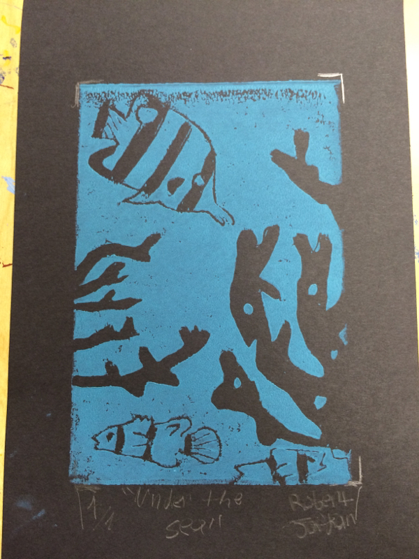 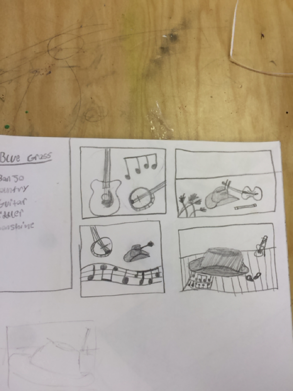
Here are the small sketches/ brainstorming ideas I drew up before we started sketching the main picture it was a little challenging coming up with ideas to sketch but after some research it became easier. 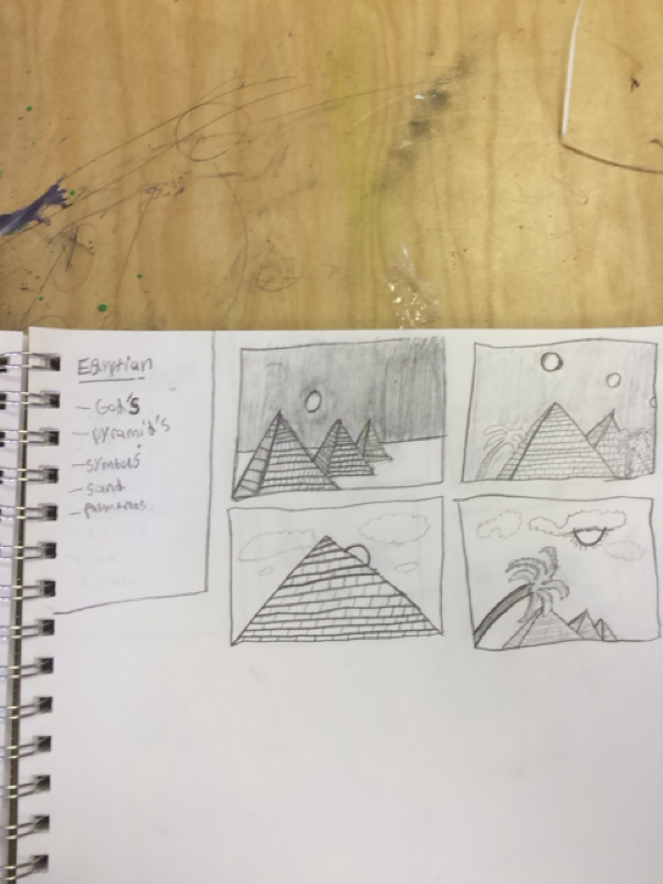
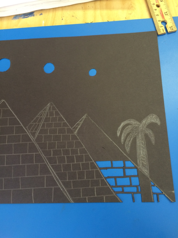
Here is a in progress view of the cutting out process for this project we had to make a musical or cultural design so I chose Egypt and the blocks on the pyramids really make the picture pop I find this a cool project because u have to be carful and precise and add little details 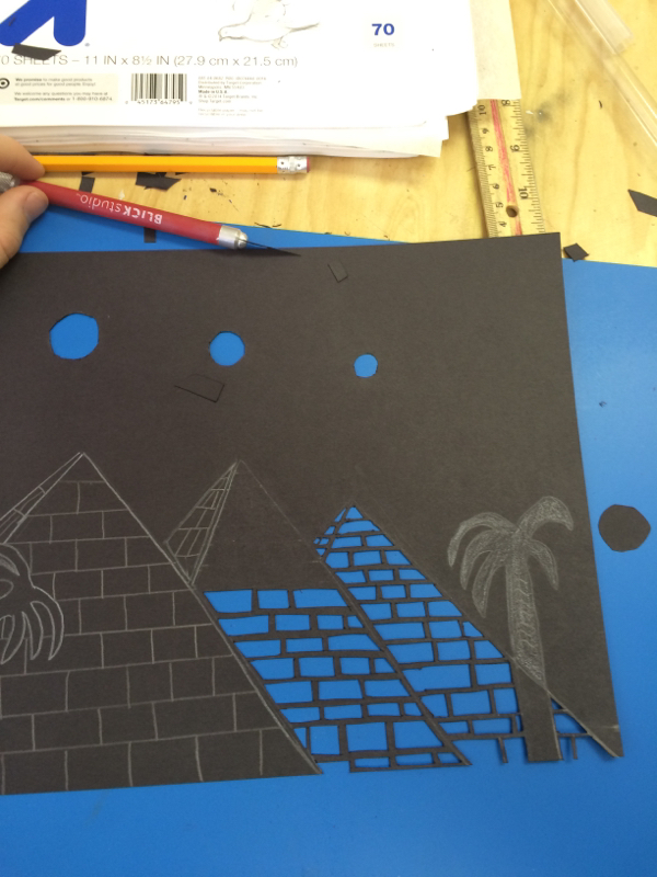
Below is the final project. While doing this project i developed my skills in making black and white stand out. And my precision at cutting because I had to cut out all of the blocks on the pyramids. I learned how to choose where and how things would look good together to during this project. I took a risk while doing this project because originally I was not going to have the blocks on the pyramids but I decided to try it because it would make it look better in was risky because the little lines dividing the blocks break easily and if the fell off it would ruin the project. During this project me and the kid next to me were both doing pyramids so we collaborated and gave eachother tips and our feed back to one another. He made his small but I made my pyramids big plus the other students around me said it looked good and gave me there feedback as well. 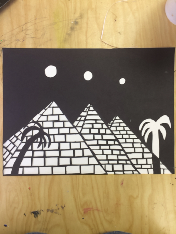
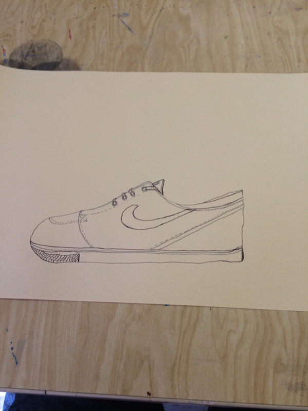
Here is a drawing of a shoe. We used this to help learn more about contour lines. We placed the shoe in front of us and we were supposed to draw all lines we can see to help make up the shoe. 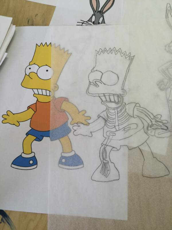
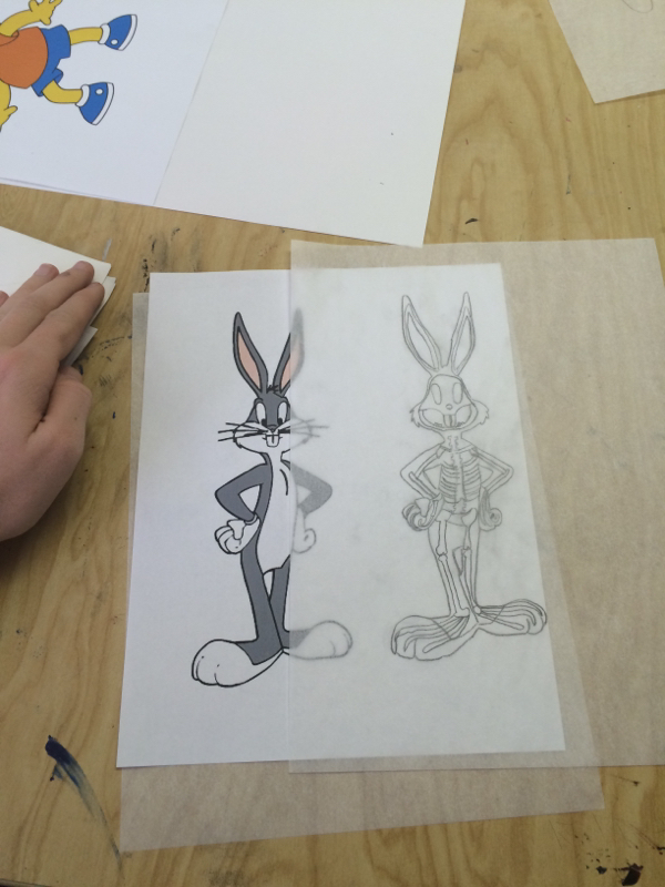
For this project we had to choose two interesting, cartoon characters and trace them and then add in a skeleton for that certain character. This project was pretty easy but hard at the same time trying to incorporate all of the bones into the character above is some of the practice drawings we hand to work on before making the final one. I chose bugs bunny and Bart Simpson for my characters. I found Bart Simpson to be the easiest one since he was bigger and more common parts to a human skeleton. For my final drawing I chose to do Bart Simpson as pictured below. I had to add skull ribs leg bones and arm bones etc... This helped us with lines and incorporate that into a drawing 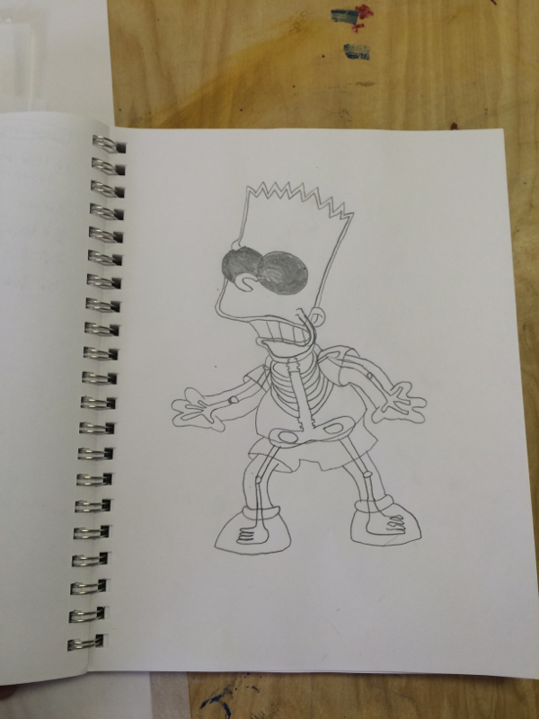
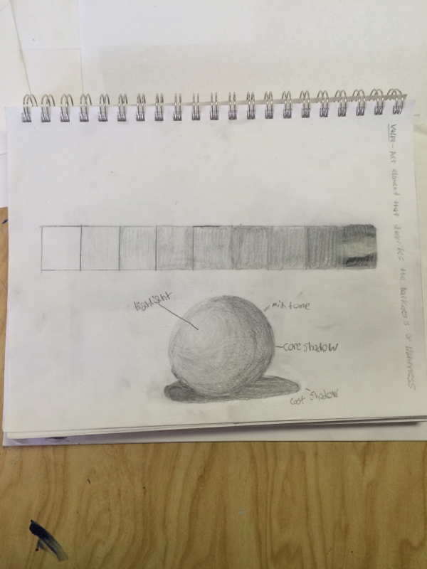
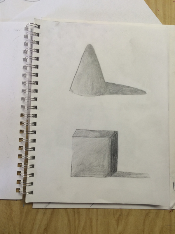
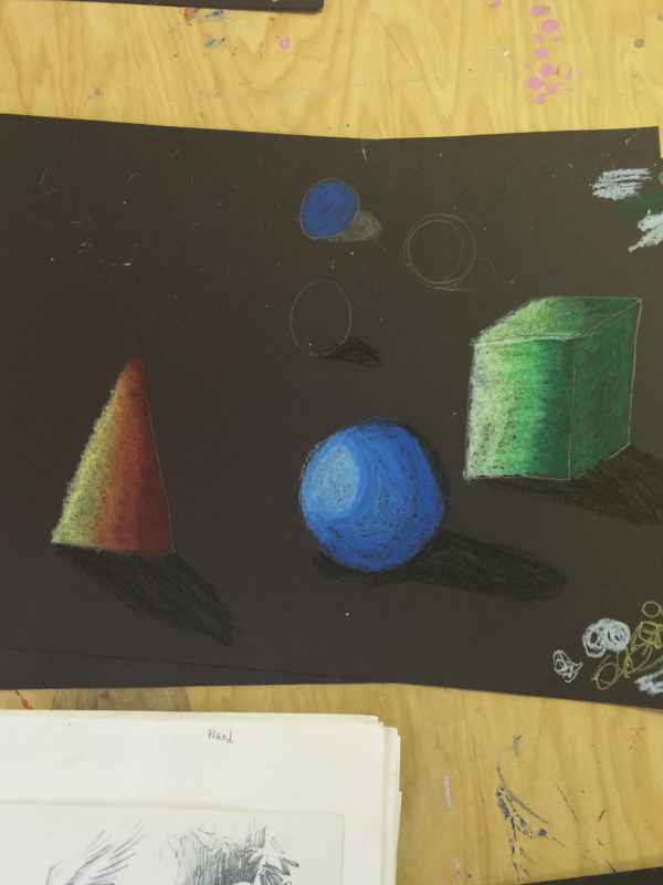
In this project we learned about shading with pencil the challange of this project was to get it to look like there was a clear light source and make the shading look like the shading flowed nicely into eachother. Above is the shading chart we had to make along with the picture of a shaded sphere, cone, and cube. I picked up on this pretty fast so I liked it and I think shading looks cool. I would like to continue to develope my skill in this and get better at it and maybe do diffrent objects. In the below picture we had to make the 3 shapes overlap to make it look cool and do give us a challange to make them stand out from one another this was the final project for shading with pencil. 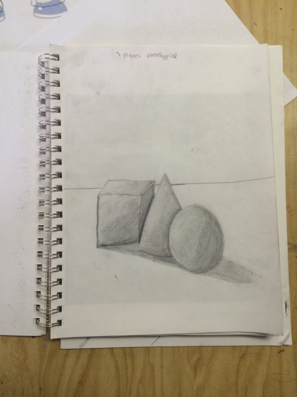
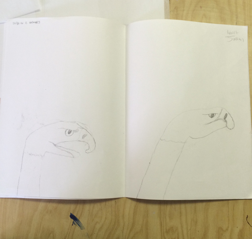
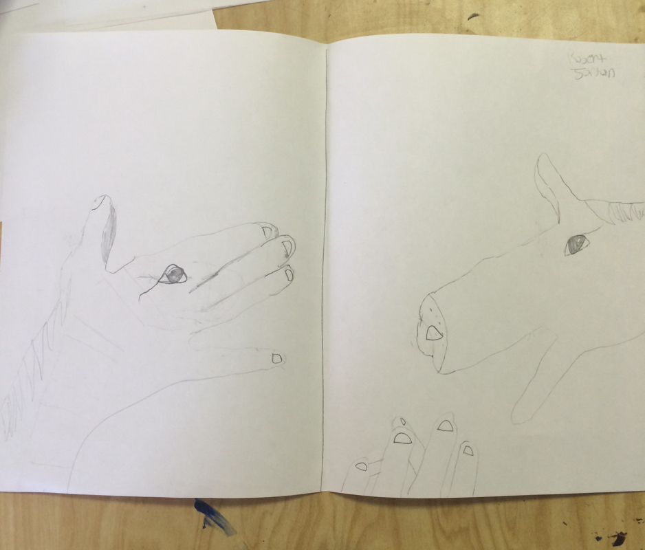
In this project we had to pick two animals and find a way to incorporate them on to a human hand. I found this a little hard to do but the horse gave me the most trouble I found the eagle to be easier to incorporate. In the above pictures are the practice drawing of the two animals we picked and we head to put them in diffrent positions which was a little difficult to do and keep it looking real. In the below picture we had to pick 1 of the 2 animals to draw so I picked the eagle. I had to make it come to life while also having it in the position a hand would. Overall I liked it once the final product came together. 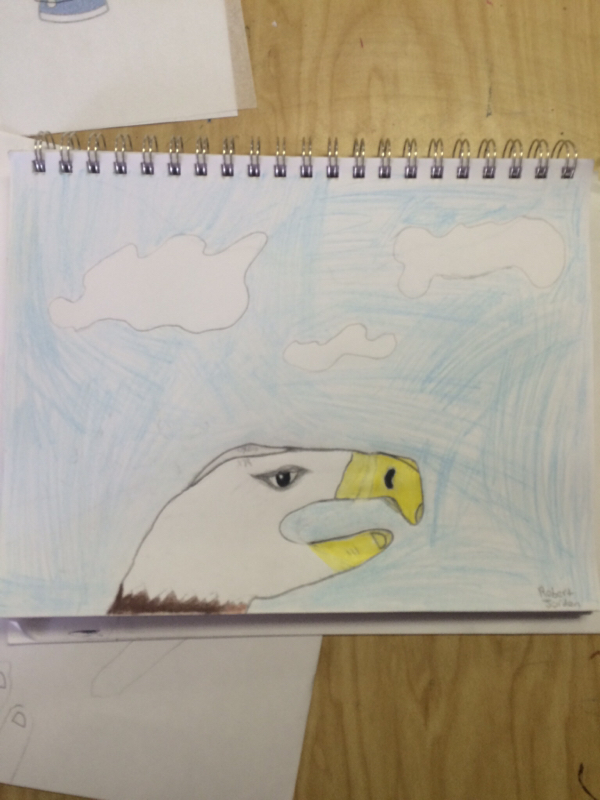
I had a good experience with oil pastels I like it better then pencil because the colors make it more interesting to work with. I created value by adding lighter colors where the light source was shining and darker colors where no light would be shining and by adding more or less pressure. The overlapping is important because it help make the shapes look more 3 dimensional and helps make it look more realistic. I had added the light source by having lighter colors where the light would be hitting which help show a clear light source. The value is important because it not only makes it look real it helps give the drawings / shading look better and give it character. The final product is below the practice sheet is the one on top. 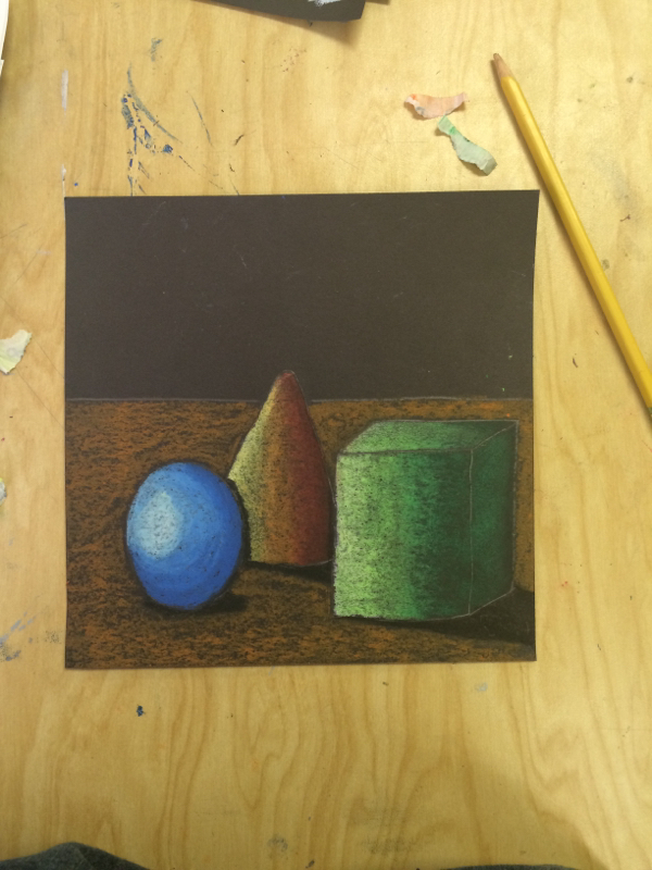
|
AuthorWrite something about yourself. No need to be fancy, just an overview. Archives
June 2015
Categories |
 RSS Feed
