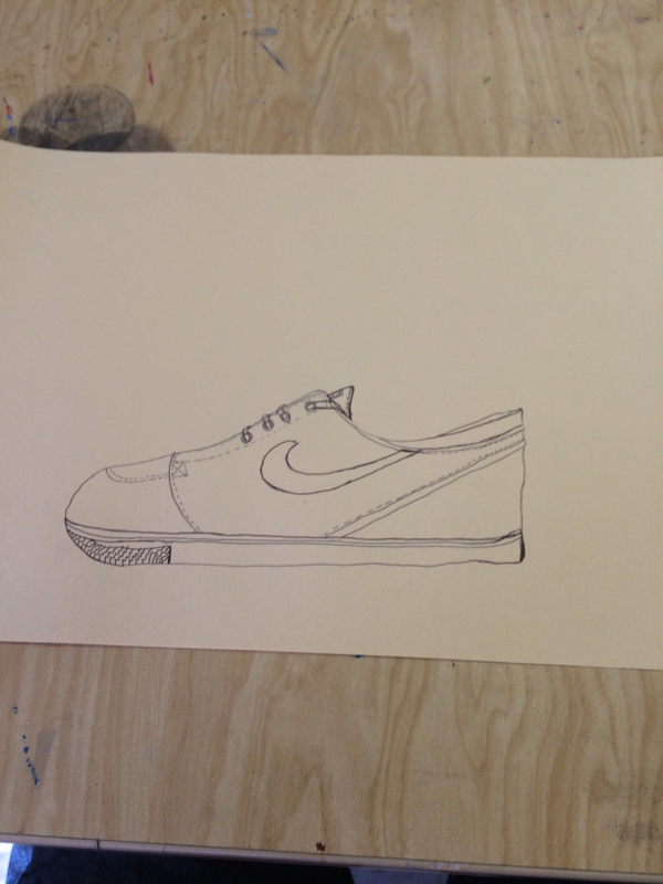
Here is a drawing of a shoe. We used this to help learn more about contour lines. We placed the shoe in front of us and we were supposed to draw all lines we can see to help make up the shoe.
0 Comments
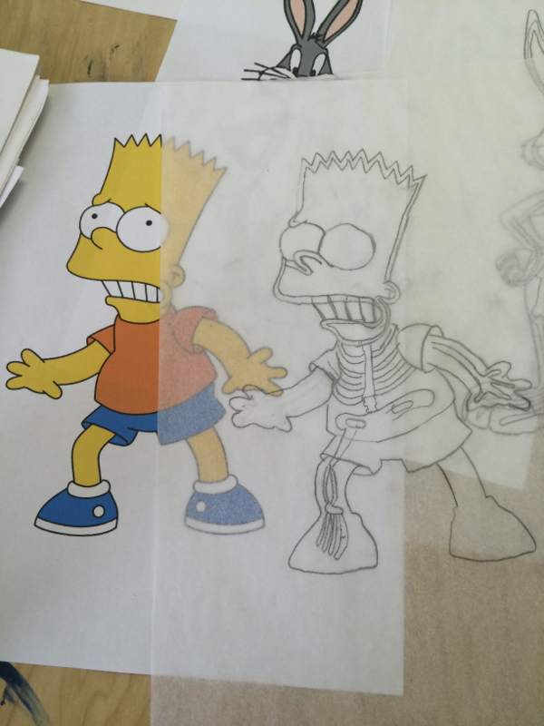
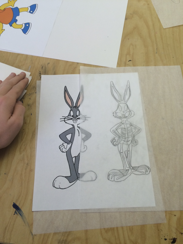
For this project we had to choose two interesting, cartoon characters and trace them and then add in a skeleton for that certain character. This project was pretty easy but hard at the same time trying to incorporate all of the bones into the character above is some of the practice drawings we hand to work on before making the final one. I chose bugs bunny and Bart Simpson for my characters. I found Bart Simpson to be the easiest one since he was bigger and more common parts to a human skeleton. For my final drawing I chose to do Bart Simpson as pictured below. I had to add skull ribs leg bones and arm bones etc... This helped us with lines and incorporate that into a drawing 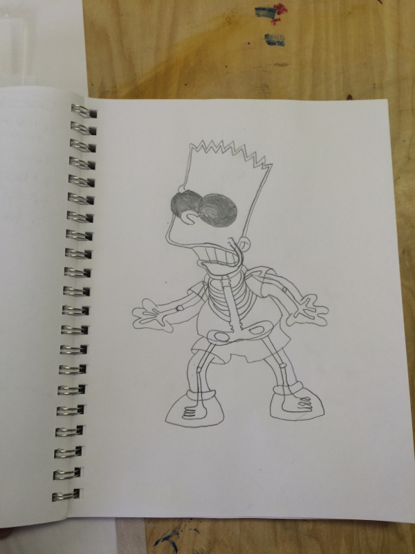
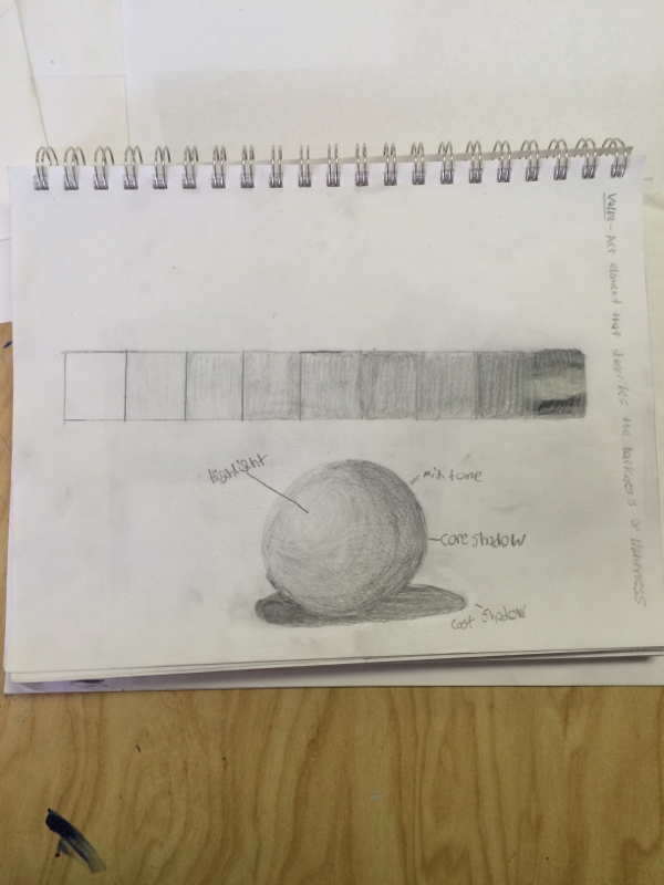
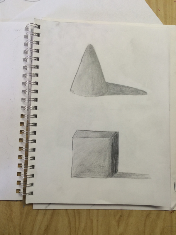
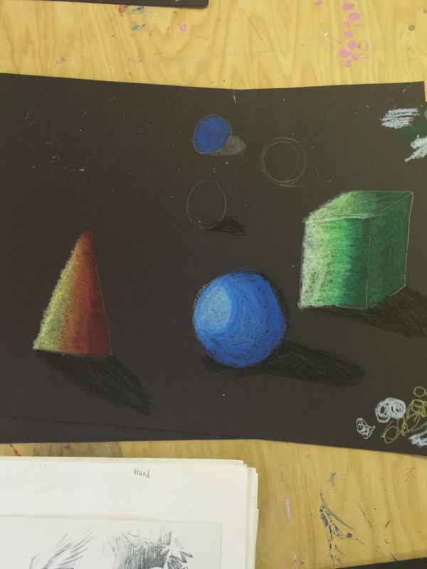
In this project we learned about shading with pencil the challange of this project was to get it to look like there was a clear light source and make the shading look like the shading flowed nicely into eachother. Above is the shading chart we had to make along with the picture of a shaded sphere, cone, and cube. I picked up on this pretty fast so I liked it and I think shading looks cool. I would like to continue to develope my skill in this and get better at it and maybe do diffrent objects. In the below picture we had to make the 3 shapes overlap to make it look cool and do give us a challange to make them stand out from one another this was the final project for shading with pencil. 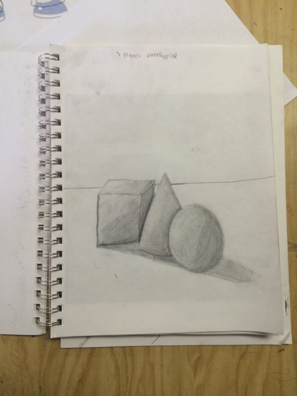
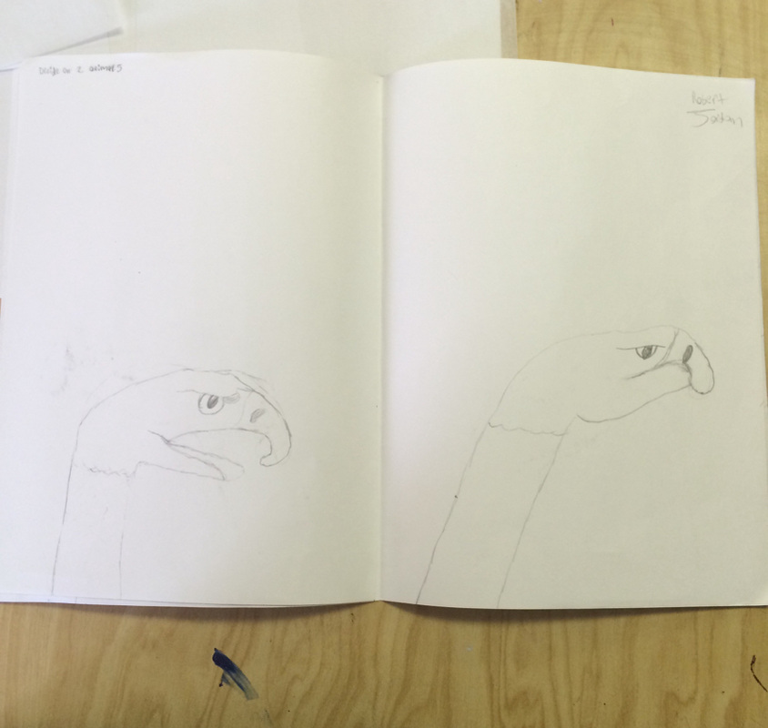
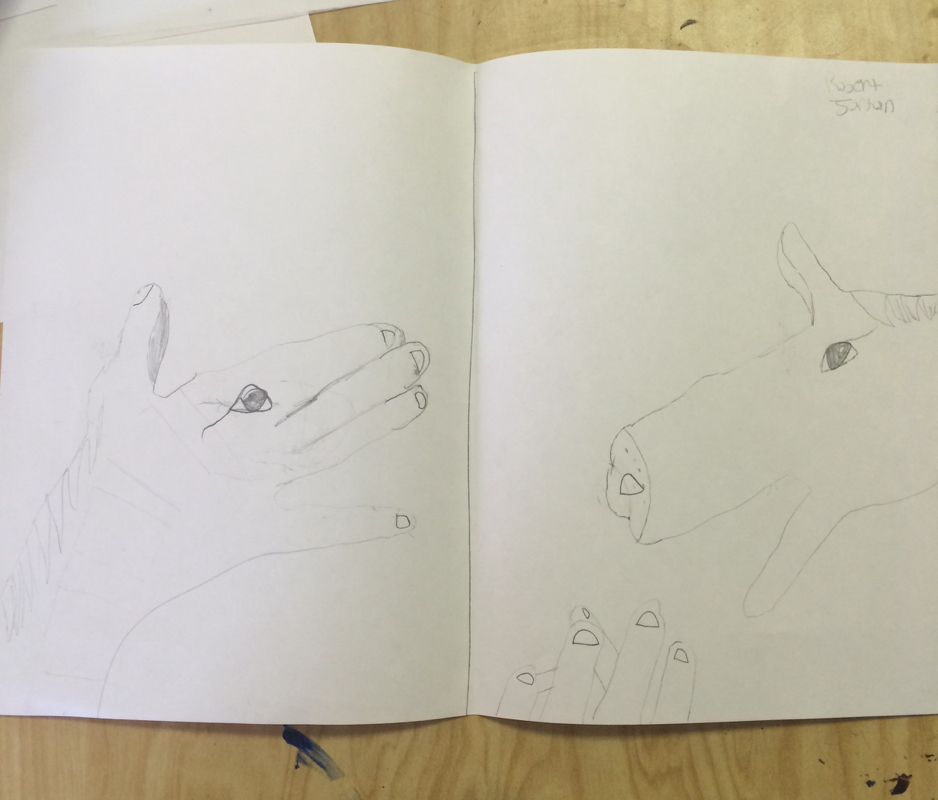
In this project we had to pick two animals and find a way to incorporate them on to a human hand. I found this a little hard to do but the horse gave me the most trouble I found the eagle to be easier to incorporate. In the above pictures are the practice drawing of the two animals we picked and we head to put them in diffrent positions which was a little difficult to do and keep it looking real. In the below picture we had to pick 1 of the 2 animals to draw so I picked the eagle. I had to make it come to life while also having it in the position a hand would. Overall I liked it once the final product came together. 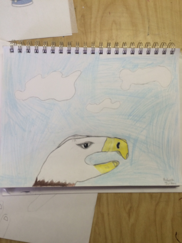
I had a good experience with oil pastels I like it better then pencil because the colors make it more interesting to work with. I created value by adding lighter colors where the light source was shining and darker colors where no light would be shining and by adding more or less pressure. The overlapping is important because it help make the shapes look more 3 dimensional and helps make it look more realistic. I had added the light source by having lighter colors where the light would be hitting which help show a clear light source. The value is important because it not only makes it look real it helps give the drawings / shading look better and give it character. The final product is below the practice sheet is the one on top. 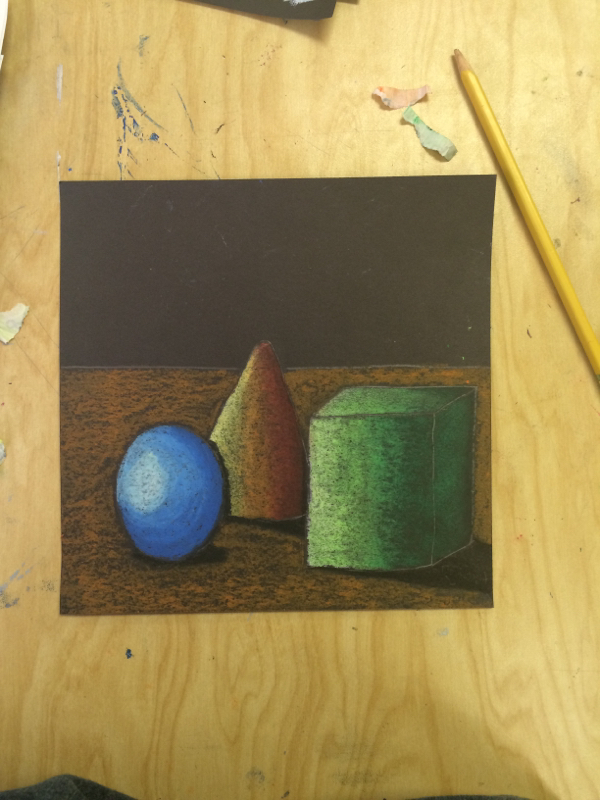
|
AuthorWrite something about yourself. No need to be fancy, just an overview. Archives
June 2015
Categories |
 RSS Feed
